


.jpg)
.png)
.png)
%20(1).webp)
How to make PowerPoint charts look professional (and not like PowerPoint)
Data can be really persuasive in landing your message and guiding decisions. But it’s also easy for charts to just look like an afterthought. Here are ten quick ways of tweaking the default PowerPoint charts to make your document look high quality. And a bonus tip: how to save those changes as a template for easy re-use.
Tip 1: Don’t paste charts in
If you write documents in PowerPoint that include charts, I’m assuming that you are wrangling the data in Excel. But if you want to show that data as a chart in a PowerPoint document, you have a few choices. Here’s what I recommend that you don’t do, and then the method that I use.
Don’t paste a picture of the chart. It won’t look right. It will probably be pixelated unless you paste as SVG - and even then the text layout can go wonky. But it definitely won’t match the text style and size of the rest of the slides. And unless you’ve copied the theme in, it won’t have the right colours.
Don’t paste and embed the spreadsheet. Very dangerous, because it embeds the entire spreadsheet - people can do a quick Edit data to see every tab. Do not be that person who circulates a deck with a chart of average salaries, only to accidentally embed everyone’s individual pay grade. Or the person that adds 10MB to the size of the deck because one simple summary chart is hiding hundreds of thousands of rows of source data.
Don’t paste and link. This sounds so tempting: charts that automatically update when you update the source spreadsheet. But the wheels soon come off when you email the deck out and not everyone has access to the spreadsheet. Or people aren’t online to refresh it. And if you want to point to a different version of the spreadsheet it becomes very painful to maintain. Only do this if you are going to be the only person working on the deck and the spreadsheet, and you plan to circulate it as a PDF.
So, what do you do? You split the process into two separate parts. Excel does the data, PowerPoint does the charting:
- Manipulate your data in Excel, and create a table with the final calculated data that you want to plot. I like to create a separate tab for this.
- Insert a new chart in PowerPoint. When the datasheet pops up, copy the calculated data from Excel into the data window. If necessary, use Select Data to point the chart at the right data cells.
- Format your chart to fit with the rest of the content on your slide, and your template’s overall colour and font themes.
- When the data changes, just copy and paste it from the Excel into the chart again (Right-click > Edit Data)
If you aren’t quite sure what type of chart to use, then do your prototyping in Excel. It uses the same charting engine and will be quicker to create and tweak the charts.
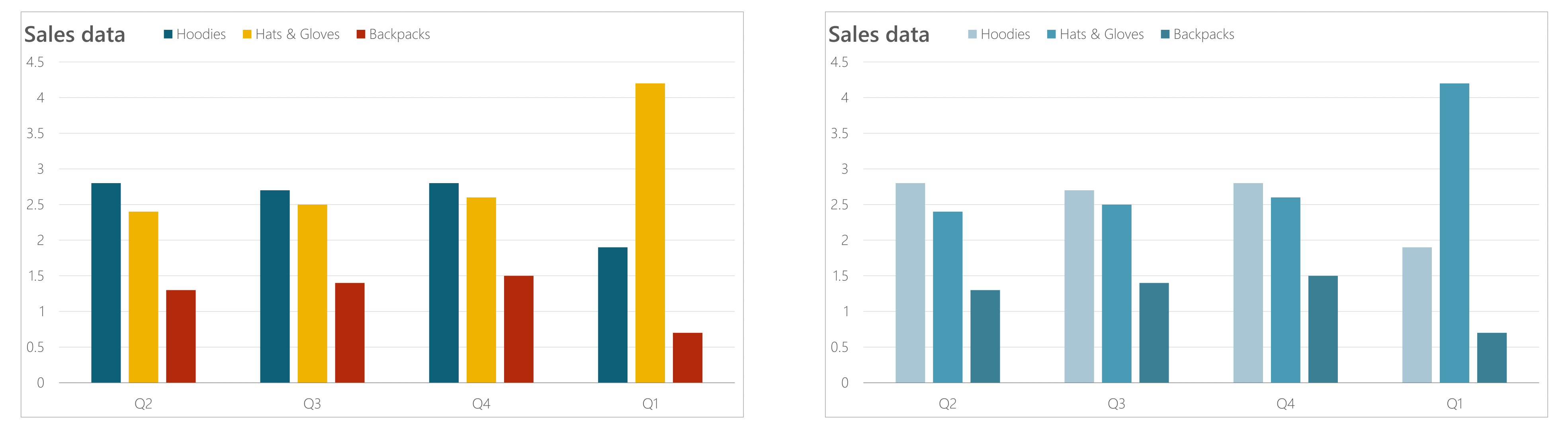
Tip 2: Tone down the colours
When someone looks at a chart with lots of different colours, you make it harder for people to decode the information. See if you can manage with a monochrome chart instead.
.png)
PowerPoint makes this really easy for you. On the Ribbon go to Chart Design > Change Colors. You'll see a set of monochromatic options in your theme colours, both decreasing and increasing brightness.
If you have so many different data series that there isn’t enough colour difference between them, then you might be showing too much data. Think about grouping data items together, especially smaller numbers.
Tip 3: Forget about the chart border
No one needs a box around the chart to know that they are looking at a chart. And we could do without the extra visual information to process; it’s just clutter. So select the edge of the chart and set the outline colour to No Outline.
If you are working on a fairly complex document, it’s likely that the charts will just be one item on a slide - you’ll probably have some commentary about the chart, or perhaps a table or data. Or even more charts. But if there is no border, what do you use to align the chart with those other items?
You use the Plot Area: this is the box inside the chart that contains the chart itself. The useful thing about the Plot Area is that it will snap to other objects and to Smart Guides.
Imagine you are placing a chart above a text box (which will contain some background and a conclusion).
- Make the chart itself a bit wider than the text box.
- Select the Plot Area - click on the background inside the chart, rather than near the edges.
- Use the handles to resize so that they align the Plot Area with the text box (or whatever else you are using.
.png)
Tip 4: Lose the axes and gridlines and use data labels instead
Will people looking at your chart want to know the exact value or the data points? If they probably will, then remember it’s frustrating to estimate the size of a bar or the height of a line by reading across to an axis. This is where data labels come in.
And if you have data labels, then you can dispense with the gridlines, and probably the axis itself.
.png)
You add data labels in three ways:
Chart Design > Add Chart Element > Data Labels
Select the chart > Click the + by the top right corner > Data Labels
Right-click the data series > Add Data Labels
Try different positions, and consider reducing the font size; the default size is often too large. Deleting gridlines and the axis is very easy: select it and press the Delete key.
This is my default way of presenting most simple charts, but there are some exceptions:
If there are a lot of data points, the data labels will be hard to fit in and even harder to read. Use an axis.
If you are using a stacked bar chart, the total value is often important. While you can go to the effort of creating a fake transparent series and data labels, the quickest way is to keep the gridlines and axis.
Tip 5: Move the axis
We are all used to the horizontal axis at the bottom and the vertical axis at the left. But these are just defaults, and it is often useful to have them elsewhere. Here are two examples.
Example 1: You are showing values changing over a period of time, and the current values that they have ended up on are the most interesting. If you put the vertical axis on the right, then the line ends by the axis - making it easier to see where they are now.
.png)
Example 2: You are showing various items compared on a scale, such as a percentage. Putting the horizontal axis at the top reminds people of the scale as they begin to parse the chart.
.png)
Moving the axis is simple, if rather counter-intuitive:
- Double click the other axis - the one you don’t want to move
- In the Format Pane, set the Horizontal (or vertical) axis crosses to Maximum axis value or Maximum category (whichever option is presented to you).
If you have already deleted that other axis (good for you) then just add it back in first, then delete it again afterwards.
Tip 6: Create your own slide title
Probably the simplest of these tips. Chart titles are the teenagers of charts: hard to move around, won’t line up with anything else, painfully fiddly to format and insist on using their own font colour which isn’t on the palette.
Don’t bother with them. Delete that awkward chart title and add your own text box, which will probably helpfully already be in your default font and size and colour. And is easy to format and to align with everything else.
One nuance to be aware of: if you have the chart selected when you insert the text box, it will become part of the chart. So if you move or copy the chart, it will come along with it. There are pros and cons to that, but be aware that if you are trying to move a text box and you can’t move it outside the chart, it’s because you added it to the chart instead of the slide.
Tip 7: Make your title helpful
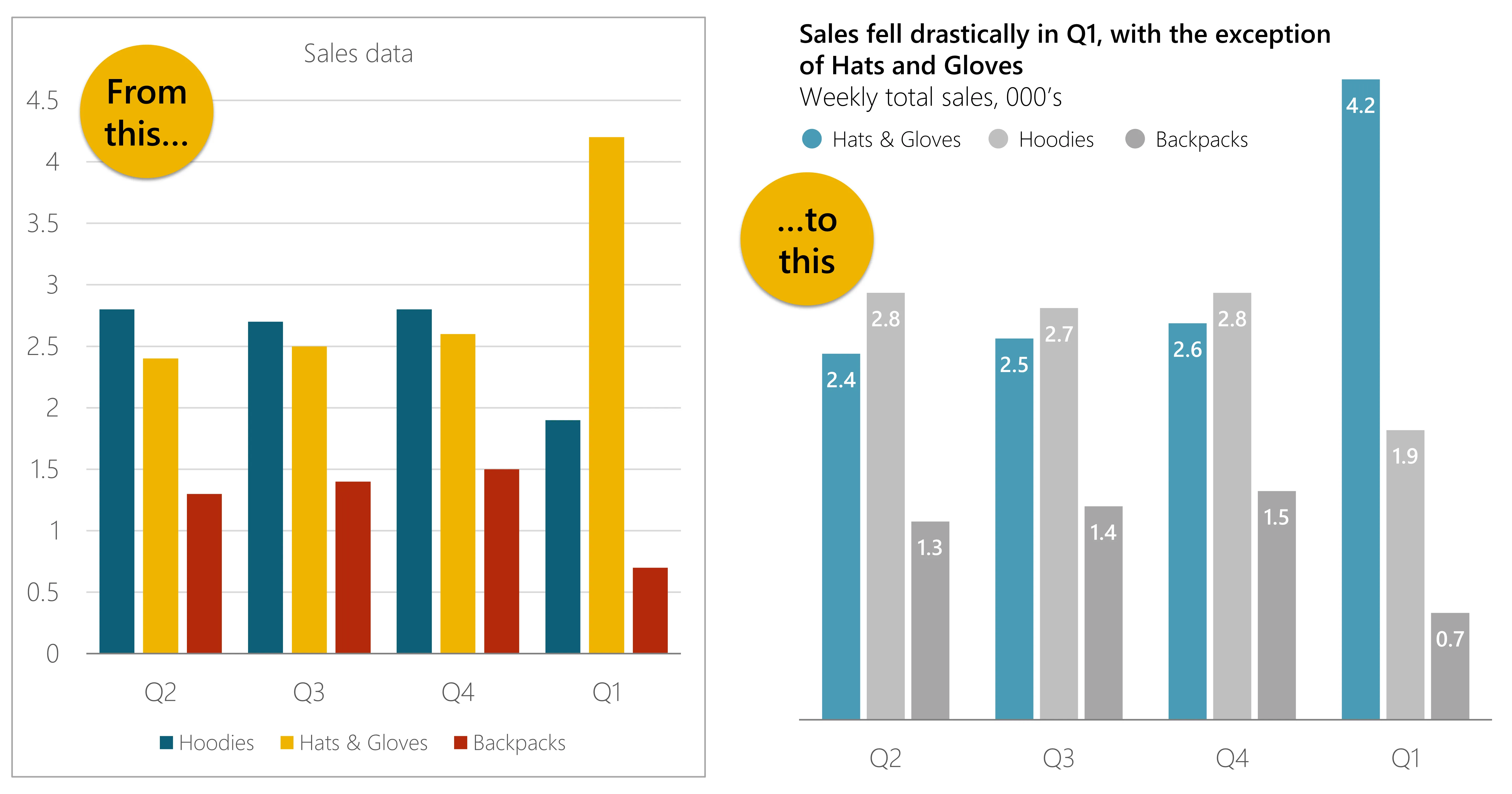
The chart title has two important jobs to help readers make sense of what they are looking at:
Job 1: state the conclusion that the chart supports. Don’t just say ‘Sales data Q1 2022’. Tell the reader what information they can get from the chart, for example: ‘Sales fell drastically in Q1, with the exception of Hats and Gloves’
Job 2: state the measures. What are the numbers people are looking at, and what are the units? For example: ‘Weekly total sales, 000’s’. Or ‘Monthly revenue, €M’
I like to make sure that it is clear that there are two pieces of information, so my default approach is to put the conclusion in bold and the measures in normal text (or a light version of the font). I will usually also put the measure on a new line, so the example above might look like this:
.png)
If you are keeping them on the same line, try using a pipe character to separate them. A pipe is a vertical line, usually above the \ character on a keyboard. So a shorter version of the example above might be:
Sales fell drastically in Q1 | Weekly sales, 000’s
And place your title where it will be read first, so for western readers put it top left. You want readers to see the title before they read the chart so that they have the conclusion in mind and they know what the data is before they decode the chart.
Tip 8: Build your own legend
PowerPoint chart legends are not great. The colour swatches are tiny. So I tend to delete the default legend and build my own one. It only takes a couple of minutes using a simple table. The advantage of doing this is that it gives you full control over the size and placement of your legend, as well as helping it to not look like a PowerPoint chart.
- Create a table with one row, and two columns for each metric.
- Fill the first cell with the data colour, and use the second cell for the label. Repeat for each series. If you’ve chosen an automatic monochrome colour scheme as suggested above, then use the Eyedropper to match the legend colours.
- Use the Layout tab to set the width of the colour cells to something suitably small. Tip press Tab, Tab, CTRL+Y to quickly hop between each coloured cell and repeat the width setting.
- Adjust the label cell width appropriately - make sure there is enough of a gap on the right before the next colour key
- Consider changing the top and bottom cell borders to zero.
Then your legend will look something like this:
.png)
If you are using a line graph, then instead of filling the colour:
- Split the colour key cell into 2 rows, 1 column
- Reduce the font size in both new cells so that they aren’t making the table too high (I usually just type 1 in the font box)
- Set the table border between the two small cells to be the same colour and thickness as the line in question. You can also set dashes as well if you are using them.
Your legend will look something like this:
.png)
Creating your own line legend doesn't look all that different from the inbuilt one, but it's easier to align.
Or to really make it look like it isn’t a PowerPoint graph, use a circular symbol:
- In the colour key cell Insert > Symbol. Set font to Segoe UI Symbol and enter character code E21A. Click Insert.
- Set the font colour to match the chart.
.png)
Other symbols are available, and you can increase and decrease the font size to your taste. But stick to Segoe UI Symbol as the font, because it is a Microsoft Cloud Font, so is very compatible across Windows, MacOS, iOS and Android.
Important: whatever you use for your legend, always place it above the chart. As with the chart title, you want your readers to be aware of the tools they have to decode the chart before they start trying to work out what to conclude. If you are short on space and the layout of your chart allows, you can place the legend on top of the Plot Area. We've done that in the example above.
Tip 9: Use horizontal bar charts more
If you are creating a bar chart and the horizontal axis is not time, then you should probably be using a horizontal bar chart, not a vertical one. There are a number of very good reasons for this.
The best reason is the axis labels: you won’t need vertical text, so it is immediately easier to read. If you have long labels, you have the inevitable choice of small text, diagonal text or vertical text – all of which are hard to read.
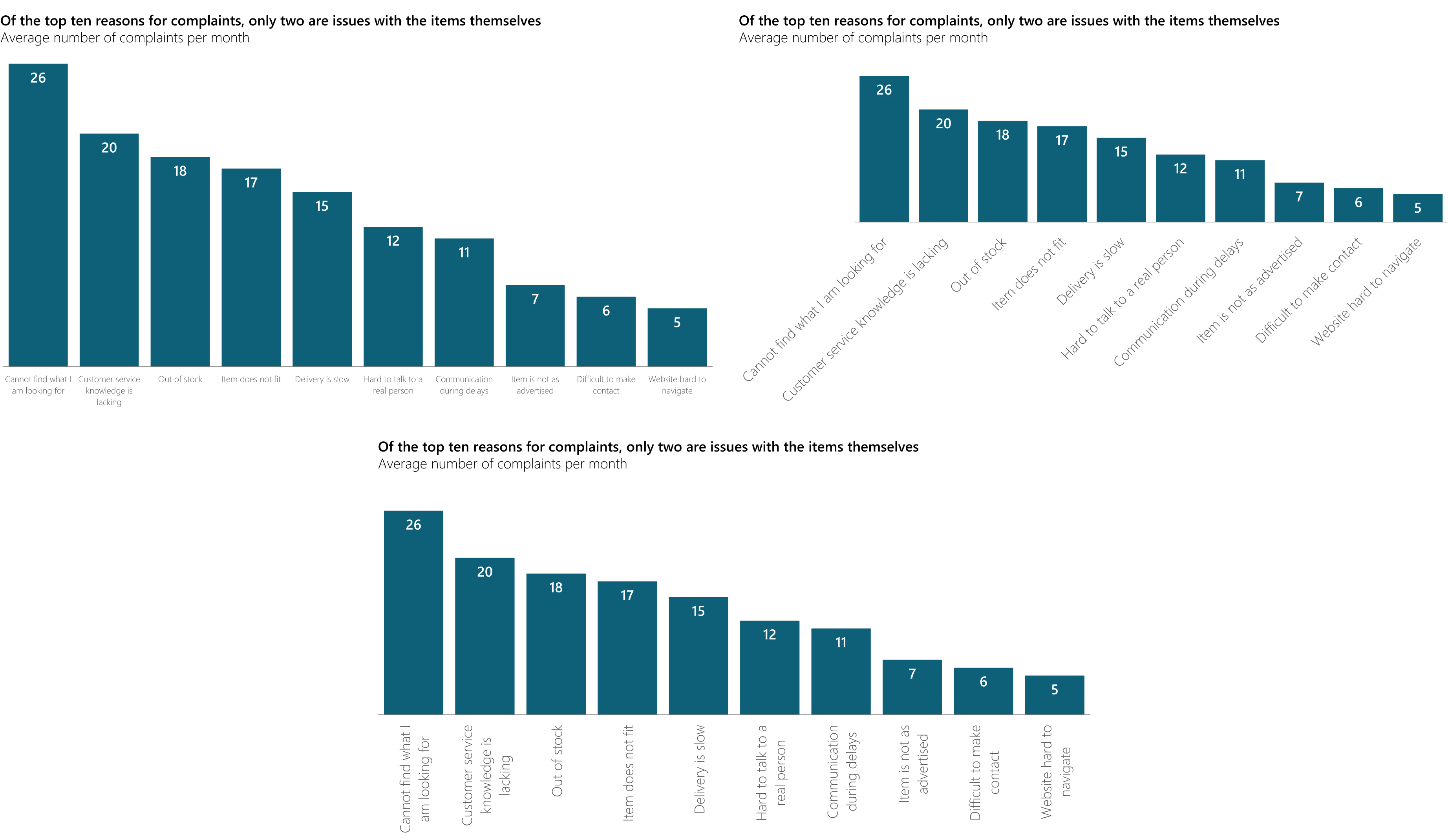
Also, given the landscape nature of slides, you are likely to have a chart that is wider than it is tall. Horizontal bars are therefore longer, making relative differences in size clearer.
.png)
Better still, you can dispense with the axis instead, and add labels to the bars:
.png)
- Select the data series and add data labels.
- They will show the value as default, which is not what we want. Double click the labels to show the Format Pane. Under Label Options, check the Category box and uncheck the Value box.
- Delete the vertical axis.
- For long bars add them Inside Base and for short ones Outside End. You may need to change the font colour for sufficient contrast, depending on the colour of your bars.
- Long labels will probably wrap over more than one line. If you don’t need this, select the labels, then in the Format Pane select the Size & Properties icon at the top, then uncheck Wrap text in shape. If you do want them wrapped then use CTRL+L to left align them if necessary.
Important: in most cases, you should also rank your data from largest to smallest (or perhaps smallest to largest). You do this by sorting the data in the datasheet. But Excel will plot the top of the datasheet at the bottom of the chart, so you’ll get the opposite order on the chart. To fix this, either sort the data the wrong way in the datasheet, or in PowerPoint select the vertical axis and in the Format Pane check the Categories in reverse order box. This will also move the axis to the top, which as we’ve discussed can be helpful.
In the example above, the actual data labels are not important. However, if you want to add them, you can keep the Value box checked in step 2. Rather than the default comma, try a new Line. Or type a space then a | then a space in the box like this:
.png)
Having the numbers at the end of the bars is more complicated and would require creating a second fake data series and making it transparent and completely overlapped. We won't go through the method here, but if you are experienced you should be able to work it out, so it looks something like this:
.png)
Tip 10: Highlight important data points
You should be using a chart to help land a message. If it’s complicated, you may need to draw attention to particular data points in your chart. There are a few ways you can do that.
For data bars, you can use a contrasting colour for a series or a single data point. This works even better if you have de-highlighted all other data by making it grey.
.png)
The same works in pie or doughnut charts:
.png)
For a line chart, add a marker, or make the marker bolder. You can also add a data label to specific points. To isolate one data point, click the line to select the whole series, then click the specific data point in question, then format.
And for any type of chart, consider adding labels to introduce narrative right onto the chart, These one-cell tables work particularly well.
.png)
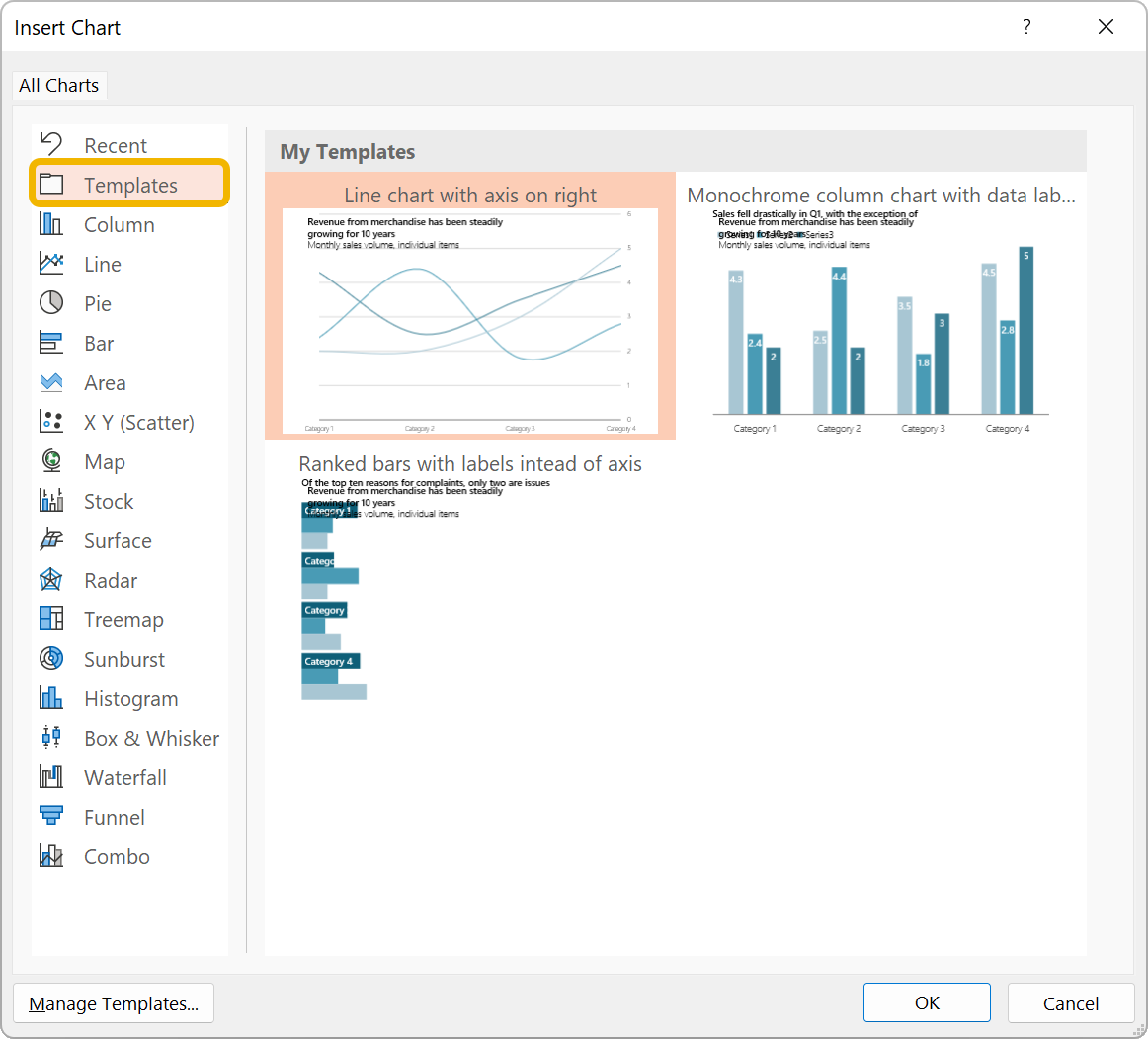
Bonus tip: chart templates
All this might seem like a lot of clicking. It is. But it’s worth it – until you’ve got a deck with lots of charts. Don’t panic, there is a feature that will save you time: the chart template.
Once you’ve got a chart looking how you want it:
- Right-click on the chart and choose Save as Template.
- Give it a suitable name.
- Create a new chart. In the list, the second option is Templates. Select that and you’ll see the chart template you just created. Note that they are previewed with sample data so won’t look quite like your charts did.
- Choose it.
You can also use this to Change Chart Type.
Be warned: not every aspect of every tweak you did will be included, but it could still save you a lot of time.
Looking for more ideas?
We can help with complex documentation – with or without charts – or train your team to create higher-quality slides and charts. Contact us to find out more.
Want more tips like this in your inbox?
It's useful*
It doesn't flood your inbox (monthly-ish).


