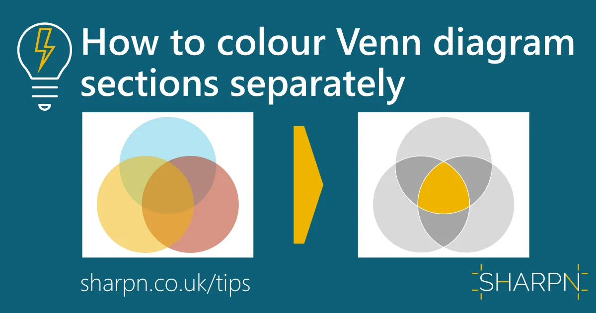


How to colour Venn diagram sections separately
Venn diagrams are a great way of showing overlapping concepts, sweet spots and synergies. However, the default way of showing the overlap relies on semi-transparent colours. This means that you end up with mixed colours that are not part of your template’s colour palette. And they don't work well on dark backgrounds.
But there is another way: use the Shape Merge tool to split the Venn into separate shapes. It’s really straightforward.
1. Draw the circles
Set up your overlapping circles. This is easy if you only have 2 circles. For an easy way of laying out 3 or more circles, see the bonus tip at the end of this article.
Don’t format your circles yet, they will all end up the same colour after the next step.

2. Fragment the circles
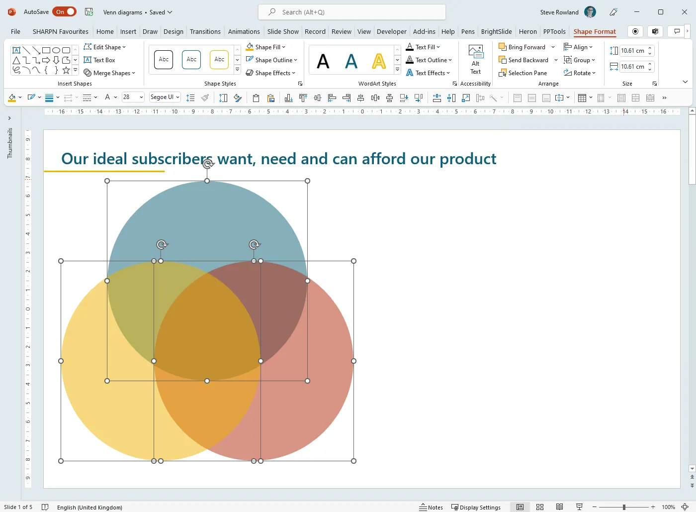
Select all the circles
Go to the Shape Format ribbon tab
Under Shape Merge choose Fragment
You will now be able to individually select the shapes. It’s worth grouping them now to make it harder to accidentally move one or more of them.
Note that all the shapes will have the formatting of the first shape selected.

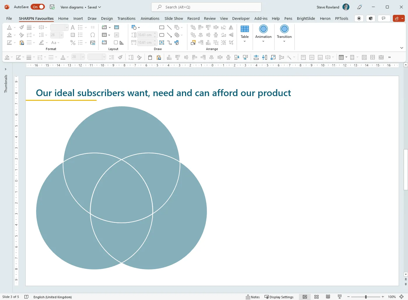
3. Add a white outline
Add a white outline to all shapes. This is important because the fragment will not create shapes that line up exactly against each other, and you might be able to see tiny ‘cracks’. An outline avoids this. (If your slide does not have a white background, set the outline colour ro match the background.)
4. Remove any transparency
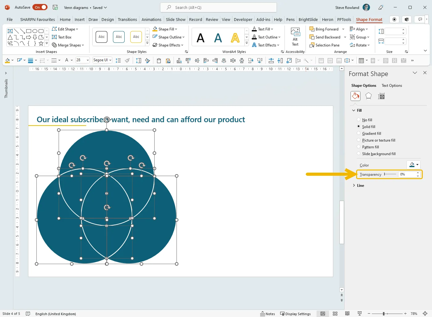
If you are converting an existing Venn diagram, or if you have created one from SmartArt using the bonus tip below, your shapes may have transparency applied. To use apply your colour palette you’ll need to remove that:
Select all the shapes
Right-click and choose Format Shape
Expand the Fill section if necessary
Move the Transparency slider to zero
5. Format
Now you are free to format as you see fit. It’s worth remembering that in many cases the overlap is the critical part of the message, so consider using a bold colour for that, and shades of grey for everything else.
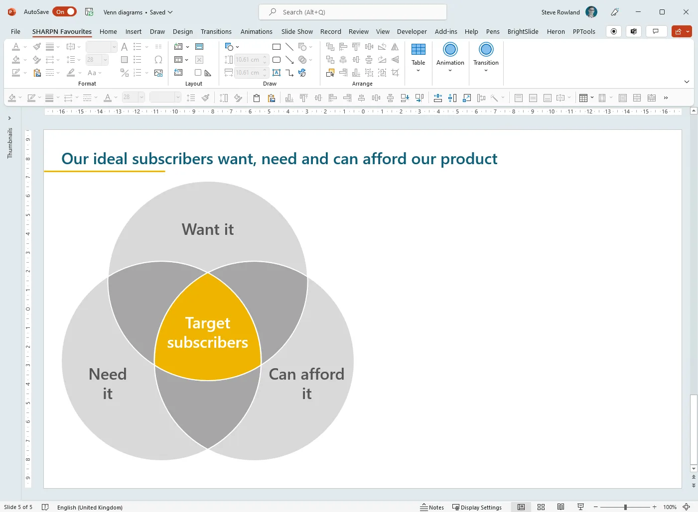
When it comes to adding text, because the shapes are so irregular, it can be tricky and time-consuming to adjust the margins to move text in the shape around. This is one situation where I would recommend using separate text boxes on top of the diagram, rather than typing into the shapes themselves.
Bonus tip
The most common form of Venn diagram has three circles. It’s really tricky to align these so that they are spread into a perfect triangle. Luckily, PowerPoint has a built-in shortcut for you: SmartArt.
Insert > SmartArt
Under Relationships, choose Basic Venn
On the SmartArt Design tab > Convert > Convert to Shapes
Ungroup
If you want to adjust the amount of overlap, with all three circles selected, hold down CTRL+SHIFT and drag one of the corner handles.
Want more tips like this in your inbox?
It's useful*
It doesn't flood your inbox (monthly-ish).


.jpg)
.png)
.png)


