


.jpg)
.png)
.png)

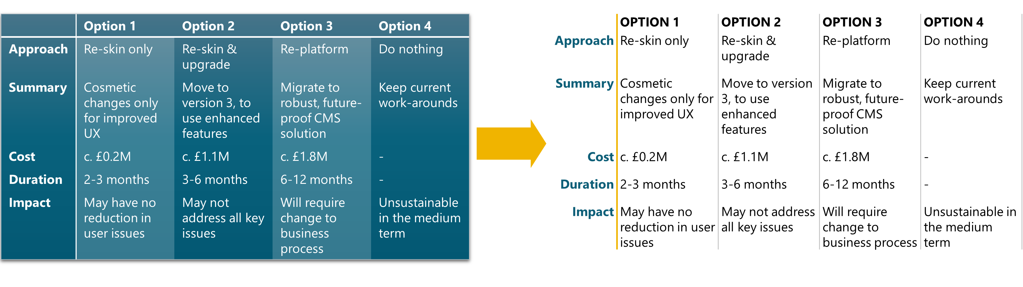
How to format better tables
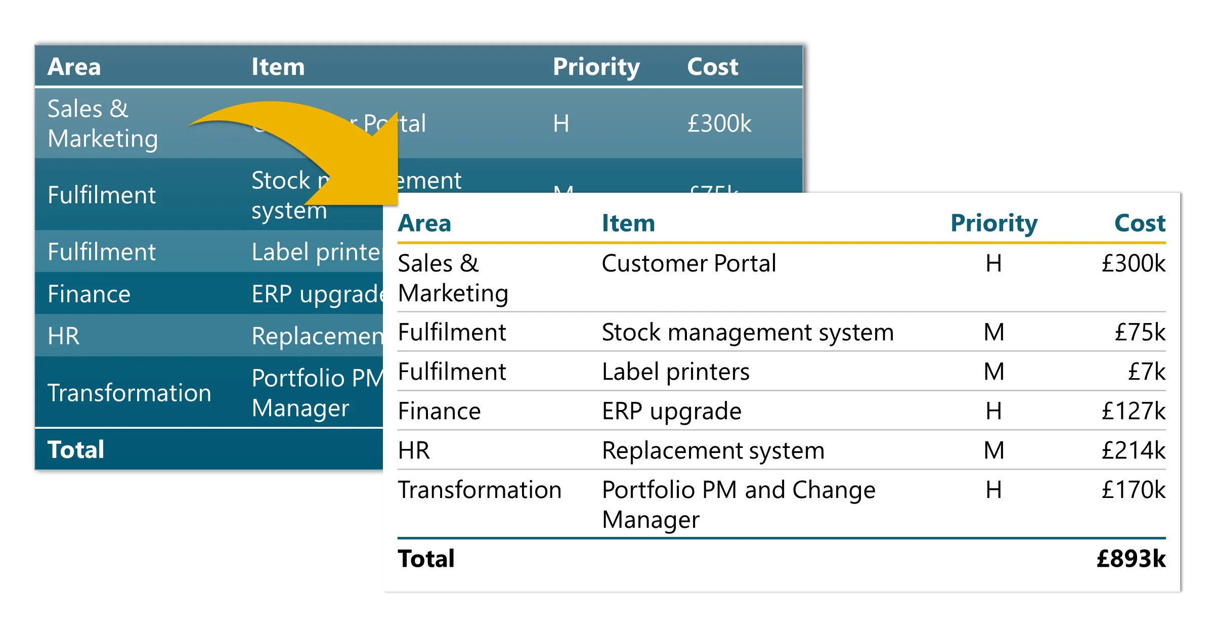
Tables in PowerPoint are incredibly powerful because they keep content automatically aligned, which our brains appreciate. But the default tables usually overdo the formatting, distracting from the actual content. Which makes your readers have to work harder to process the ‘so-what’ of the information.
The simplest way to declutter tables is to use only half of the borders. The alignment of the text means that we see the rows and columns, even with no borders at all. So treat the borders as a way of grouping the information. And keep them subtle.
Here’s our step-by-step guide to a cleaner, more effective table. Plus ready-to-use examples that you can download and paste into your decks. And suggestions for streamlining the steps.
Steps for a better table
Note: we haven’t included recommendations for font size, as that depends on your content. However, we do recommend using a consistent size throughout your document, and it probably needs to be a couple of sizes smaller than your default text size.
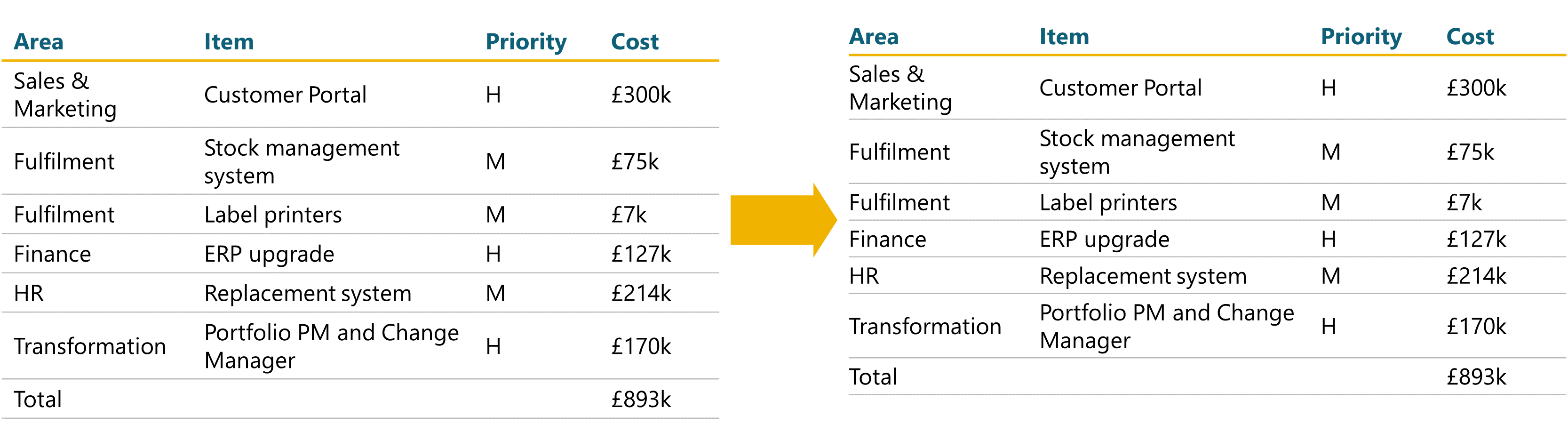
1. Clear out the default formatting
Depending on your template, your default table format could have all sorts of table borders, fill and font formatting. You could either go through and remove each of those in turn, but we recommend applying one of the built-in table styles.
Go to the Table Design tab, and in the Table Styles dropdown you can choose either:
No Style, No Grid - this clears out everything but is harder to use in practice because you can’t see where the rows and columns are while you are formatting it.
No Style, Table Grid - this clears everything but leaves a simple black cell border for the whole table. This option is easier because you can easily see where the rows and columns are. You just have to remove any unwanted borders in Step 3.
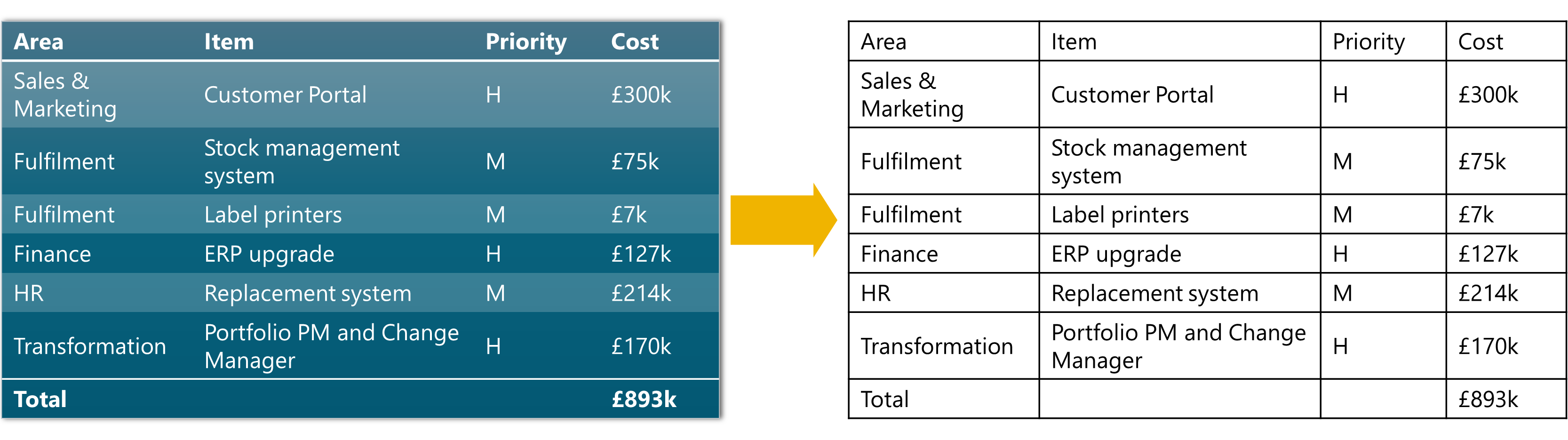
2. Format header row
This is our go-to format for the column headers:
Make the text bold. Optionally, add a font colour using one of your accent colours (as long as it has enough contrast against the background). Or use all-caps.
Add a border below using 1½pt or 2¼pt thickness and in one of the key accent colours.
Turn the top border off. The quickest way to do this is to select the top border button to turn the border on and then click it again to turn it off.
3. Add row borders

Our standard format for rows:
Thickness ¾pt
Colour: mid-grey. Either the middle of the 5 shades under white (Darker 25%) or a suitable neutral pallet colour.
Turn all column borders off - left, right and inside.
You should now be left with just horizontal gridlines
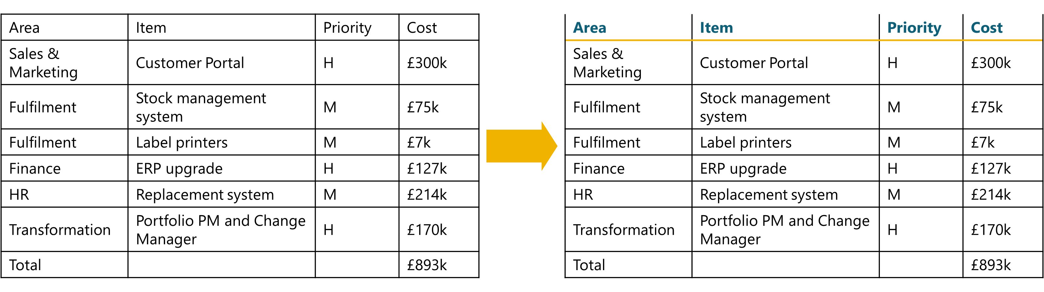
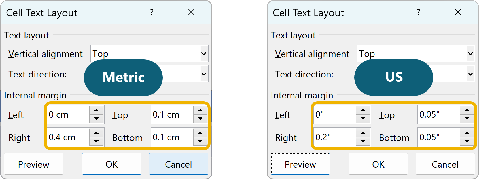
4. Adjust the margins
A default table will have fairly wide margins that are often too wide for detailed content. Plus, with no vertical borders, you can take the text up to the edge so that it aligns with the horizontal border edges, giving your tables a more aligned look, and making better use of screen estate.
So we recommend a zero left cell margin but a right cell margin that is big enough to make sure the text from adjacent cells doesn’t run into each other. We also put a small top and bottom margin to help separate the individual rows.
Select the whole table. Table Layout > Cell Margins > Custom Margins
Set the custom margins as follows - Left: 0, Right: 0.4cm, Top: 0.1cm and Bottom: 0.1cm. (For US users, in inches those are: 0”, 0.2”, 0.05” and 0.05”.)
Optionally, if you want to you can also:
Select the last column and set the right margin to zero (since there is nothing for it to run into).
Select the header row and set the top margin to zero (if it is important that the text top-aligns with anything else on your slide).
Bonus tip
You can also adjust cell margins in the Format Shape pane, under the Text Box section. The advantage of this is that you can see the changes as you make them, no need to use the Preview button.
5. Text alignment
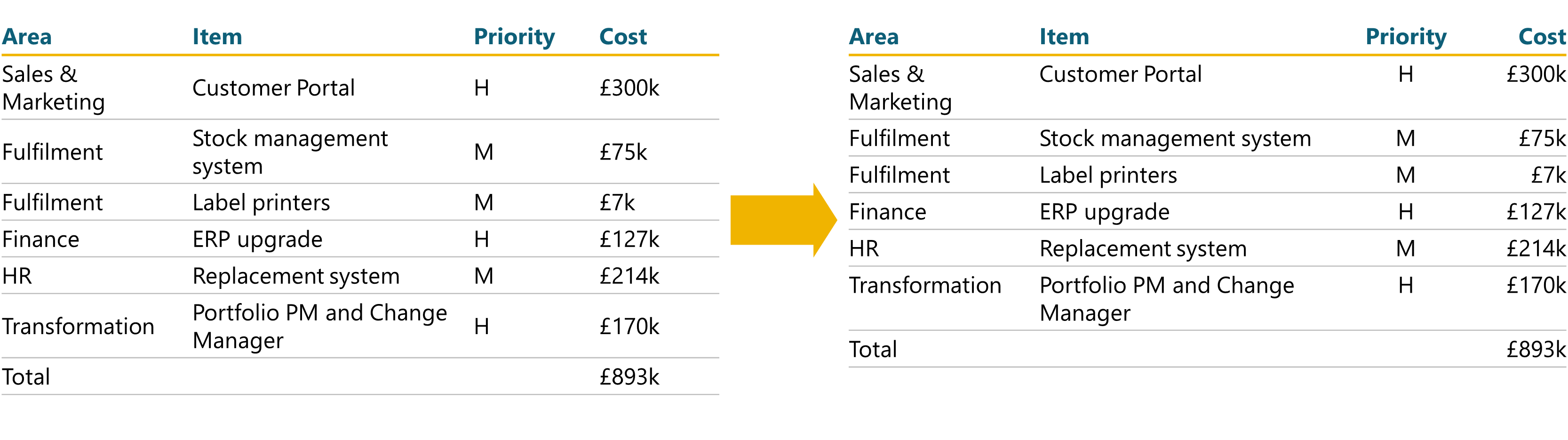
Different types of content work best with different text alignments. So go through each column and change the alignment if appropriate:
Left-align: General text: sentences, short phrases, full names
Centre-align: Short fields: dates, Y/N, RAG status, initials, short labels/tags, simple numbers (no more than two digits)
Right-align: long numbers, and any financial figures
For rows, it’s generally easier for readers to top-align all the content.
6. Format the bottom row (if relevant)
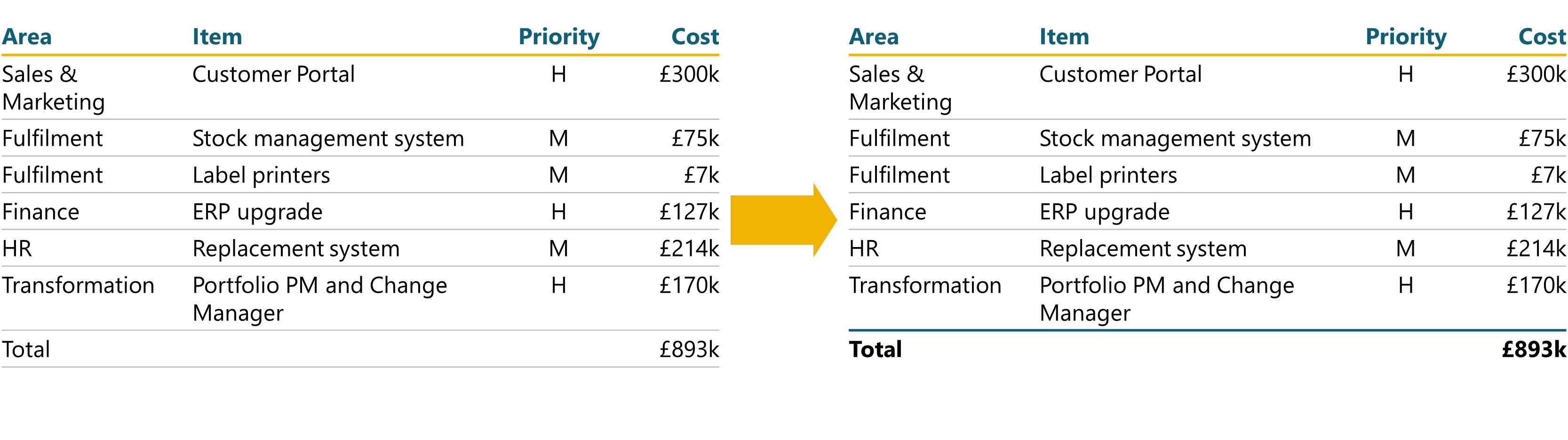
If the bottom row contains totals or summary information, you need to make it clear that it is different from the rows above. We suggest the following:
Borders: a top border of the same thickness as the header row. You could use the same colour, or you could use a different accent colour or just black or dark grey. You could also add an identical bottom border.
Text: make the text bold, and potentially use a different colour from the header row text. We usually keep the font size the same.
What if my data is in columns?
Essentially, just transpose the rules above. A couple of notes:
The first column will contain the header labels. So use the same formatting as above but consider right-aligning the text in that column.
You will probably want to format the first row because these are likely to be option headings. A simple bold and/or all-caps, plus maybe a colour will suffice. But try to so something slightly different from the first column formatting.
The cell margins should be something like this: Left: 0.1cm, Right: 0.1cm, Top: 0 and Bottom: 0.4cm. (Or 0.05”, 0.05”, 0” and 0.2”.) Depending on your content you may need to adjust that bottom margin.
Alignment is not as applicable, so generally you can default to left-alignment for all columns.
That feels like a lot of clicking…
That is quite a few steps, but there are some ways of making this easier. Especially if you use a lot of tables:
- Talk to us about building you a template with custom table styles, or just adding them to your existing template.
- Download and re-use the example tables below.
- Install our custom ribbon. It has all of the border, margin and alignment buttons directly on the ribbon, which significantly reduces the number of clicks you need each time.
- Install the free BrightSlide add-in. As well as countless other functions, there is a table format painter that lets you copy the format from one table and paste it to all your others.
Our free download has two tables already set up. You can copy and paste these into your decks, and they will pick up your template formatting: fonts and colours.


Want more tips like this in your inbox?
It's useful*
It doesn't flood your inbox (monthly-ish).


