


.jpg)
.png)
.png)
10 signs that your PowerPoint template isn't working
PowerPoint is not without its problems. Sometimes these are frustrations borne of the way the application itself behaves. But sometimes these issues stem from the way that your PowerPoint template has been set up. And that can be fixed.
If you are suffering from any of the headaches below, we can help you. We can build you a functional, brand-compliant template that is flexible but consistent. Especially if you are using PowerPoint to create documents, rather than TED-style presentations.
⚠️Titles and content jump around from slide to slide
Inconsistently placed or formatted slide titles can cause a flick-book effect, where the title appears to move as you transition from one slide to the next. It distracts the reader from the important message and can reduce the perceived quality of your deliverable.
Or content boxes may be in different places in each layout, which has a similarly subliminal disorienting effect.
A good template will always be designed using a layout grid, which sets size and position rules – which is applied to every layout. It is also good practice to build in slide guides - although as a user it’s still up to you to turn them on and then stick to them.
⚠️I have to choose the right font and change the size on every new slide
Do you find yourself always having to select the correct font because the default is wrong? Perhaps it is Calibri or Aptos, the Microsoft defaults.
Or do you have to keep picking a more appropriate text size? Perhaps you find that PowerPoint is automatically re-sizing the text depending on how much you put it?
Default fonts and text sizes should be defined as part of the template. These then flow down to all other layouts. This creates consistency automatically – but it also gives you a single place to override the defaults if you need to.
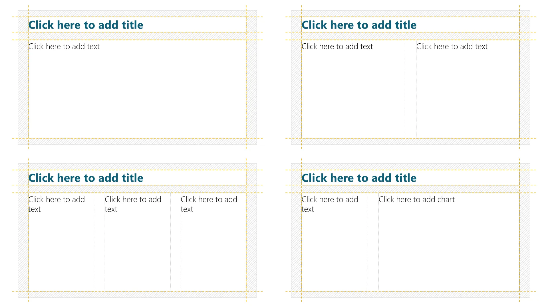
⚠️I don’t want bullets on all my text and I want to have a set of paragraph styles like Word does
Using bullets by default is never a good idea, but for years this has been the suggested default and many templates don’t turn them off. People who are familiar with using text styles in many other apps like Word are sorely disappointed to find that this functionality is not there in PowerPoint.
A well-planned template can address both of those problems. It can include up to nine different text styles. So your PowerPoint documents can have styles for paragraphs, headings, subheadings, bulleted lists, numbered lists and so on. This means that from page to page, you can maintain a consistent format. This will instantly raise the quality and impact of your deck.
We can also put these styles into text boxes and tables, not just content placeholders.
⚠️The brand colours are not set up in my template
It is surprising how often we see a company template that still has default Microsoft colours in the colour dropdowns. More often, the right colours are there but the automatically-generated shades are not useful - sometimes you’ll get shades that are too garish to use. Or the colours have been applied in a way that creates unexpected behaviours in charts or on slides with dark backgrounds.
This may be because the PowerPoint template has been created by the brilliant agency that you hired to create that great website. Unfortunately, many such agencies live in an Adobe-powered world, and lack the technical PowerPoint experience to set up a template properly.
Thoughtful application of colour can make your slides much easier to create, and much better-looking. This includes: the font colour for titles and text; use of colour in diagrams, charts and even photos; plus alternative slide background colours.
⚠️The company branding takes up too much space on every slide
It is normal for marketing departments to want your brand to shout loud from every page. That’s their job. But in a document, the reality is that branding can be more effective if it is subtle when it isn’t the star of the slide. You should give your clients credit for being able to remember you they are listening to, without a constant reminder – which could even come across as arrogant.
And if your document is for internal use, then you definitely don’t need to remind your people who they work for on every page.
We recommend obvious branding on key slides: title, section headers, contact slides, end slides and the like. But on general content slides, you can use a small, unobtrusive logo or other visual that doesn’t eat into the real estate of the page or distract from the content. This can be built into your template so that the logo is there when it is needed, and tucked-away when it’s less relevant.
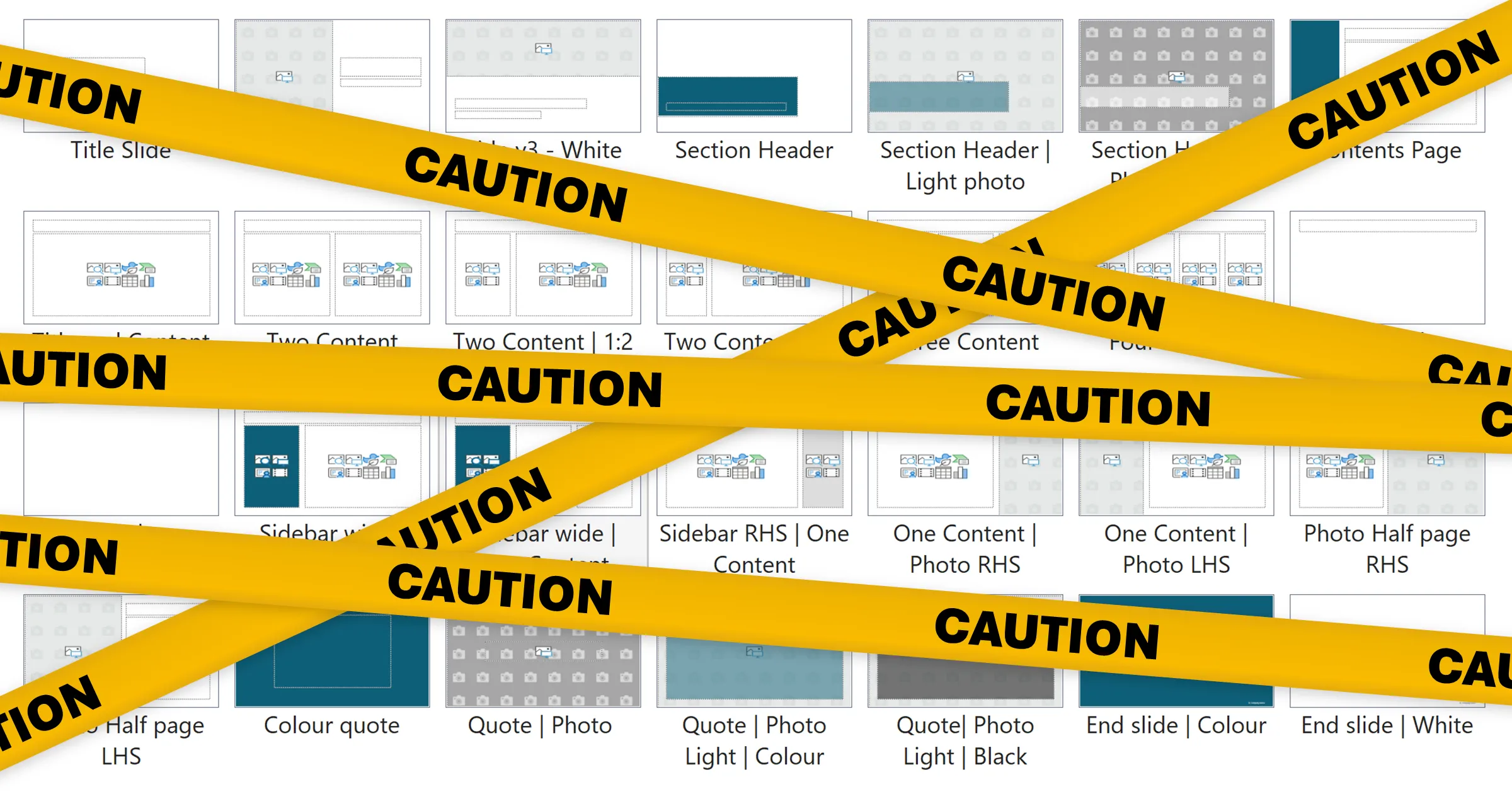
⚠️There are no useful layouts, so I always end up adapting the ‘Title and Content’ or ‘Title Only’ layout
PowerPoint was built as a tool for creating a slide show as a backdrop to a talk. But the reality is that many ‘presentations’ that are created with it now are actually documents, that need to put a decent amount of detailed content on each page. And frequently company templates have been designed for simple presentations.
So the template simply doesn’t contain enough suitable layouts, and you often have to create from scratch the text boxes, tables, charts and diagrams that you need. Which means that it’s impossible – or at least time-consuming and frustrating – to achieve the consistency needed to make your deck look good.
A properly-functional template will come with a significant number of content layouts, to give you flexibility while still maintaining the layout and format rules that make each slide feel part of a harmonious document.
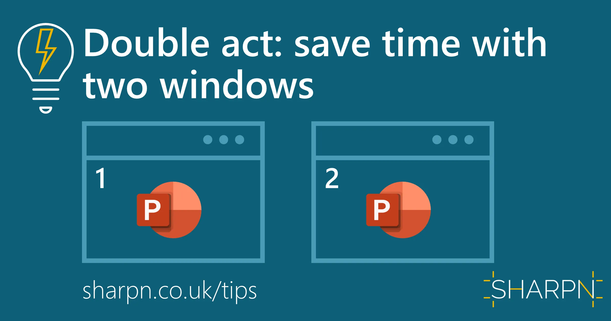
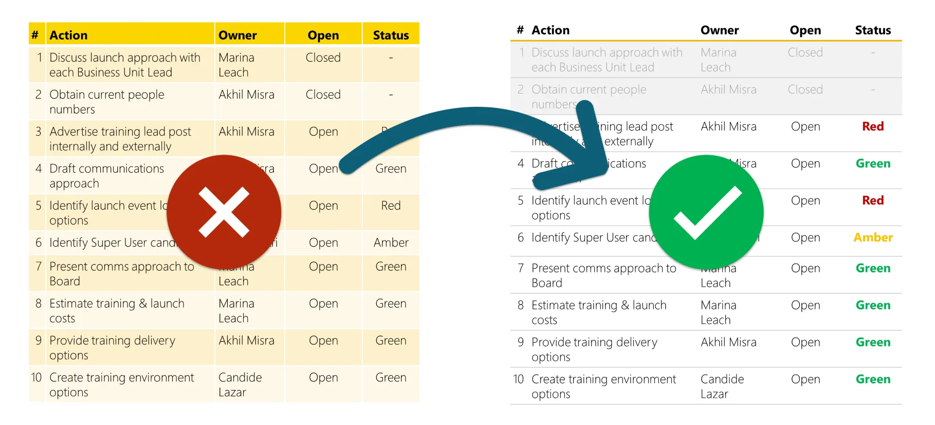
⚠️When I copy slides into my deck the colours and fonts are not correct or the content moves around
There are lots of reasons that pasting slides from one deck to another can be a minefield. It might be a problem with the source slide, or the source template. Or a problem with your template – especially if the text and colour styles have not been set up properly as mentioned above. Sometimes the default layouts have been deleted, so PowerPoint cannot work out how to match content between two decks.
One thing you can do when you paste is to copy the content, not the whole slide. Select everything (except the title and the slide number) and copy that, then paste onto a new blank slide.
There is no easy fix, but a robust template will minimise the problems and as you gradually migrate to the new template you’ll start to see the issue less and less.
⚠️My files are always enormous, even if I only have a short, simple document
Every PowerPoint document contains the whole template, even if most of the defined layouts are not used. The usual cause of file ‘bloat’ is layouts that have brand photography built-in. Most often this is well-intentioned: to provide a choice of title slides or section headers. Sometimes these images are even inserted at resolutions that are far too high, creating massive files.
The quick fix is to go into the slide Master and delete these layouts. If you find yourself doing this frequently then I highly recommend investing in Slidewise which will do this in a single click for you. And a whole lot more.
The longer-term fix is to separate sample content from the template file. We recommend having a ‘skinny’ template that has all of the layouts, but none of the photos. Then you create a second ‘assets’ file that has these layouts with the photos pre-populated. All people have to do is open this asset file, copy the slide they need, and paste it into their deck. And because you’ve built both using the same underlying template, you don’t get any of the copy-and-paste problems.
You can even deploy the content file so that it is available directly within PowerPoint, without the need for people to find it in a shared folder, or the risk of them then overwriting that master file. We can show you how to do that.
⚠️I’m fed up with having to delete dozens of sample slides every time I start a new document
It’s common for a template to contain a set of pre-built slides in an attempt to give people assets that they can copy and paste into their slides. Our experience however is that, on balance, this is unhelpful. Usually, the slides are deleted without being used. And providing charts, tables and diagrams can actually be tricky or over-prescriptive for users.
Instead, we recommend taking the same approach as for photos: put these assets in a separate document, but make it easily accessible directly in PowerPoint (we can show you how). Then only create a small number of default slides in the template. For example: a title slide, an agenda/contents page, and an end-slide.
We do however recommend including one slide that will be deleted: a ‘How to use this template’ slide that contains the main tips for people to get the best out of the new functionality. It helps with the change management of rolling out a new template – which is something we can also advise on.
⚠️When I insert a table, the text is huge and it’s got overpowering colours
If your template doesn’t override it, the default table style has a striped background colour. This kind of formatting is completely unhelpful. In fact, we advise a much more minimal use of colour and borders. But there’s very little you can do in the PowerPoint application to set a better default, which means people either stick with the ‘ugly’ default, or have to spend a lot of time manually overriding it*.
We can not only set a more sensible font size, we can build in better table styles to your template and set one of these as the default. So you need never see an overly-formatted table again.
*A shout-out here is deserved to the amazing free BrightSlide add-in. Among countless other time-saving features, it will copy and paste table formatting. So if you have a lot of tables, you only have to define your format once, then paste it to all the other tables. If you don’t have BrightSlide installed, then you’ll soon be wondering where it was all your (work) life.
SHARPN can help you
There are plenty of other signs that that it’s time to replace your PowerPoint template. We can build you a template that looks great and works brilliantly. And that helps your team create high-quality documents.
Find out more. Or book a no-obligations call to talk to us about what you are looking for.
Want more tips like this in your inbox?
It's useful*
It doesn't flood your inbox (monthly-ish).


