


.jpg)
.png)
.png)

Ten habits for high-quality PowerPoint documents
Maybe this sounds familiar: You’ve written a well-structured, clear PowerPoint deck which is going to be read as a standalone document. But it still lacks something. It doesn’t look as ‘good’ as the ones that the global consulting teams produce.
Why? Because you don’t have access to a back-office team of slide designers to do that for you. And you’re too busy to spend your time polishing slides, you’ve got a job to do!
Panic not. There are plenty of simple things you can do that will radically improve the way your readers perceive and absorb your documents. And you don’t need to be a designer to apply them.
Here are 10 habits to get into. Whether you use PowerPoint, Google Slides or Keynote, they’ll make your documents look smarter. More importantly, they will make them easier for your readers to digest. Which will make them more likely to be remembered.
Habit 1: Consistent positioning
Slide titles that are in even slightly different positions between slides appear to jump around when you move to the next slide. Our brains notice this movement, which instantly distracts your readers from the key point you want them to see.
Make sure the following things are in the same position on all slides:
Title box (and subtitles if using). Check the font size is consistent too.
Page numbers and footer (if you have one – despite PowerPoint’s default, they are not compulsory).
Position of the first text box, table or picture – does every content slide ‘start’ in the same place? (Ignore different layouts like section dividers.)
The best way to achieve this is with a robust set of layouts in your template.
Habit 2: Use guides for margins and a layout grid
This habit is connected to the one above: make use of PowerPoint’s guides to help you keep content within a consistent area. Use them to set up margins that apply to all layouts, for example. And stick to them.

Habit 3: Align, align, align
When your content is almost finalised, go through each slide and check that objects are lined up with each other, and evenly spaced. That includes text boxes: the edges of left- or right-aligned text create perceived lines, so make sure you take those into account.
There are no hard and fast rules about which objects need to be aligned to which other objects and how. It depends so much on the content. Just have a good tidy up.
Habit 4: Consistent font size
If you pick up a quality magazine or brochure, or you download an annual report or thought-piece, you’ll usually find that there’s a uniform font size throughout. One size for the body text, another size for headings, subheadings, call-outs and so on.
Applying this approach throughout your deck will give the whole document a consistent feel that implies quality. So avoid the temptation to increase font size on a slide to fill it up. Or to shrink the text to fit more in – break your content across two slides.
Either way, if you end up with some of the slide area that is not used, that’s fine. There’s no need to shy away from white space.
Habit 5: Simple, consistent colours
PowerPoint’s palette has room for 10 colours. Don’t use them all. Try this instead – see if you can manage with three colours:
White for the background
Black or dark charcoal for the body text
One other colour for titles, diagrams, charts and emphasis. You can use various versions of this colour by adjusting the lightness and saturation.

Allow yourself a fourth, contrasting colour if you need it. This one is to be used to draw attention to the key information in your document.
If you find that this isn’t enough, challenge yourself to justify why you need another colour: what is it used to represent?
Habit 6: Minimal slide ‘furniture’
Less is more: especially when it comes to people being able to understand and remember your key information. Look at everything on your slide and remove as much ‘clutter’ as you can. So readers have less visual information to process. This includes:
Table borders – try removing them all, then add back in minimal styling. You probably only need vertical or horizontal borders. Rarely both.
Bullets – only necessary on short lists (like this one). Never on paragraphs. Ignore the fact that they are there by default.
Shape styling – outline or fill, but not both. Keep them flat, no effects.
Graphics & icons – only use them if they help with understanding the point you are making. Never just to make it look ‘pretty’.
Habit 7: Step away from the logo
You love your brand – but it doesn’t need to be on every slide. It’s just one more thing for your reader to process, so it distracts from the page content.
Restrict it to the first page, and the last. And maybe on section breaks.
Habit 8: Give the reader a map
Most complex documents have logical sections, listed on a Contents page at the front. But as people read through they can lose track of where they are. It’s fairly simple to provide a map for them using one or both of these approaches:
Repeat the contents on every section break slide. Use some subtle highlighting to indicate where in the contents list this section sits. A simple bold, coloured style is enough.
Put a simple navigation bar on all slides. This shouldn’t be complex or eye-catching. Just a simple list of section headings, in a small font and out of the way at the very top or bottom of the slide. Highlight the current section as a you-are-here indicator.

And if you add hyperlinks to the content list and the navigation bar to take them to the relevant slide, that makes it even easier for readers to engage with the content.
Habit 9: Subtle footers and page numbers
You may well need commercial or confidentiality disclaimer text on every page, but it should look like it has the lowest priority. Small font and grey text will do the trick.
Same for page numbers – they should be there if people need them, but not leap off the page. Small and subtle.
Habit 10: Send as PDF
Don’t let your hard work be ruined by someone reading your document in PowerPoint edit view, or on PowerPoint mobile apps. Or by someone who doesn’t have the font you used. Export to PDF and you guarantee that the readers see it exactly the way you intended.
But that all sounds like more work...
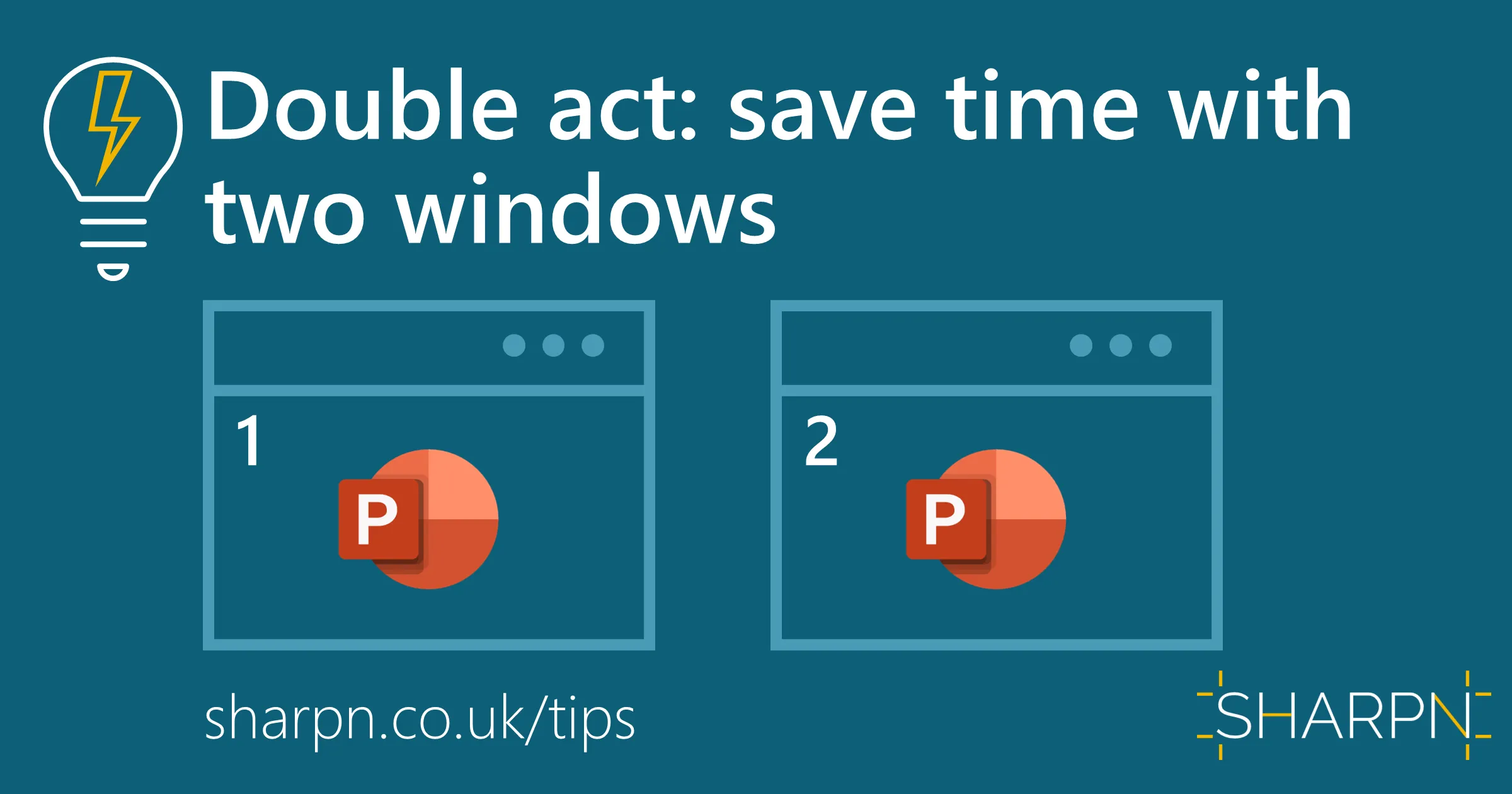
Well, yes, a little. We think it’s worth it. To offset the extra time, there are plenty of productivity tools and tips. We wrote about our favourites here.
If you want to learn more about how to implement these habits, or further ways of increasing the impact of your documents, SHARPN can provide advanced training and coaching. And if you have a critical document you need to deliver, we can help you.
Want more tips like this in your inbox?
It's useful*
It doesn't flood your inbox (monthly-ish).


