


.jpg)
.png)
.png)
Decks over docs
PowerPoint has become the go-to format for business documents. Strategies, plans, approaches, reports, status updates, training guides – and so on. And it has done so at the expense of Word. Is this evolution a good thing, or should you be worried about death-by-PowerPoint?
PowerPoint is designed for creating presentations: backdrop visual aids for a speaker. It’s not really intended as a documentation tool. But (without any hard evidence) it is probably used more for the latter, which means much of the time the slides have to do all the heavy lifting without any voiceover.
Naturally, there are pros and cons to PowerPoint decks compared to Word reports. Let's start with the plus-points of using slides to communicate complex topics:
Visual communication methods can be more effective – and PowerPoint gives you a lot more visual tools than Word does.
PowerPoint chunks the document into one screen at a time, which forces you to at least consider your narrative structure – as opposed to Word’s endless scrolling and arbitrary page breaks.
Animations in PowerPoint allow you to exert granular control over the order in which people read your content, so you can make your points in a logical order regardless of the layout – while Word relies on a top-to-bottom reading order.
Screen estate: in a world where we now consume the majority of business content on screen rather than on paper, PowerPoint’s default landscape orientation fills the screen efficiently – compared to the zoomed-out, partial-page view in Word.
Now for the cons. PowerPoint is not perfect. Far from it. If you’ve tried to create a high-quality slide document in you will have experienced these frustrations, among many others:
Guidelines but no guardrails: there are no margins. A good template has layouts that all respect the same page margins; but there is nothing to stop people from overriding these and placing content anywhere they want. And they will, reducing the perceived quality of the deck.
No styles functionality: you can’t select paragraph styling from a pre-defined list. Unless your template is set up in a specific way, you are going to have to do a lot of repetitive formatting.
No text overflow: you cannot fill a placeholder and automatically continue the text in the next placeholder. You have to perform the extra work of deciding which layout to use for the words you are trying to use.
No multi-level numbering. Actually, in our book, that is a positive thing – excessive numbering distracts from content. If you absolutely must number paragraphs (best for legally binding documents) then stick to Word.
Too much choice: there are a host of visual tools and settings that you have access to, but how do you choose the right one? Or restrain yourself from adding stuff because you think a slide is ‘boring’?
With great PowerPoint comes great responsibility
If you find yourself having to make the move to PowerPoint, you need to take more control over how your content looks if you want to make a great impression. Below are some of our top tips.
Keep text styling consistent
Stick to a single font size throughout your document for normal text. We usually recommend 14pt as a good option: small enough to allow sufficient content on a slide, but large enough to avoid eye strain for most people.
Don’t shrink text to fit more in – break it across more slides. And don’t enlarge text or create words to fill up blank space on a slide. Don’t be scared of white space; it gives your content room to breathe and your readers space to think.
Never use bullets on paragraphs – use white space instead. Bullets should be reserved for actual lists.
If you want to have styles, these must be built properly into your template. Contact us to find out how. A good template can help maintain text consistency while providing layout flexibility.
Tables are your friend
By their nature, tables keep their content aligned. The brain loves a straight line, so you are already onto a winner. So if your text has any kind of structure to it, a table can really help people understand that.
But don’t fall into the trap of adding heavy formatting. You need far fewer table borders than you might imagine. Just enough to help group the cells.
Narrative is key
Don’t forget that you are explaining a complex topic to someone who does not know what you do. And may not be invested in the same way, or have the same agenda. Help them find their way to reaching the conclusion that you want them to by leading them carefully through the story.
Slide titles play an important role. Avoid short labels: use the title as a headline, or a punchline that the rest of the slide is there to prove, or to expand upon.
A picture paints quite a lot of words
If you find yourself describing a sequence, a hierarchy, or an if-this-then-that situation, then you will be far better off drawing a diagram. And you don’t need to be overly inventive: people understand what chevrons, org charts and flow diagrams are, so just use those.
But remember to align everything and label clearly. If you are using icons, make sure you’ve chosen carefully. If you can’t find an obvious icon, don’t use one. And don’t go crazy with them.
For more ambiguous content, photos can be helpful. Especially when employing a metaphor.
Just because you can, it doesn’t mean you should…
Do not add visual ‘stuff’ because you think your slide looks boring. Don’t add colour, icons, photos, charts or SmartArt unless they add clear value to the message.
Never strive to make your slides pretty or exciting or fresh. Strive instead to make them effective. And to do that, the key is often just simplicity.
If you need more ideas or support, we can train you and your team on creating high-impact slide documents. And we can build you a better template that helps, rather than hinders.
Want more tips like this in your inbox?
It's useful*
It doesn't flood your inbox (monthly-ish).
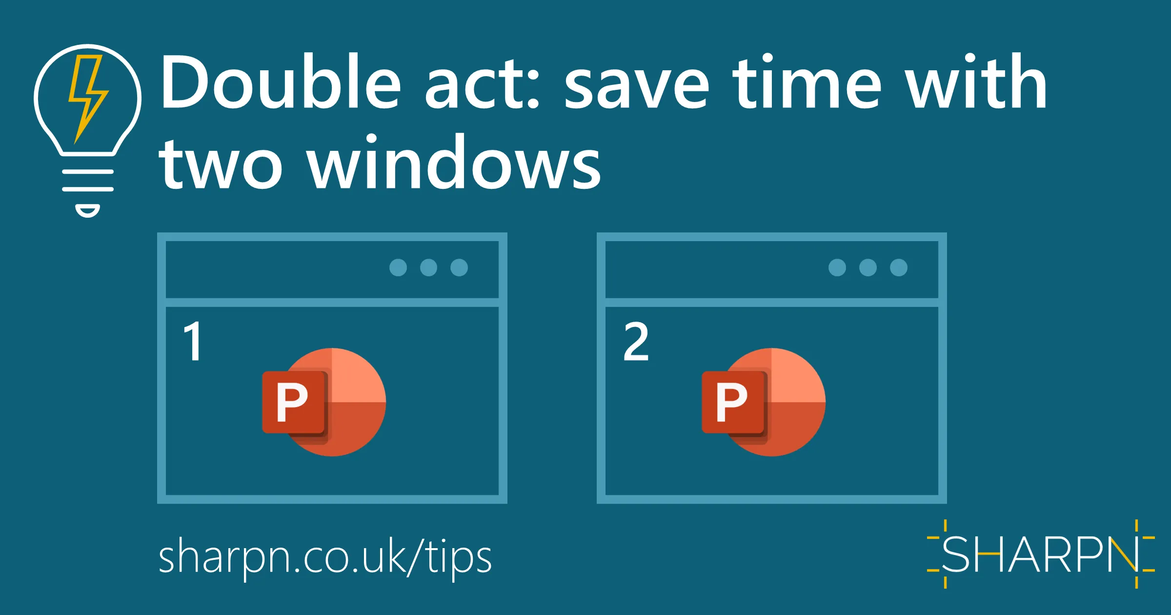
One quick thing you may not know you can do in PowerPoint
One time-saving keyboard shortcut to learn
One free tool that could be useful
Short introduction to an article about good visual communication


