


.jpg)
.png)
.png)
How to create a great logo cloud
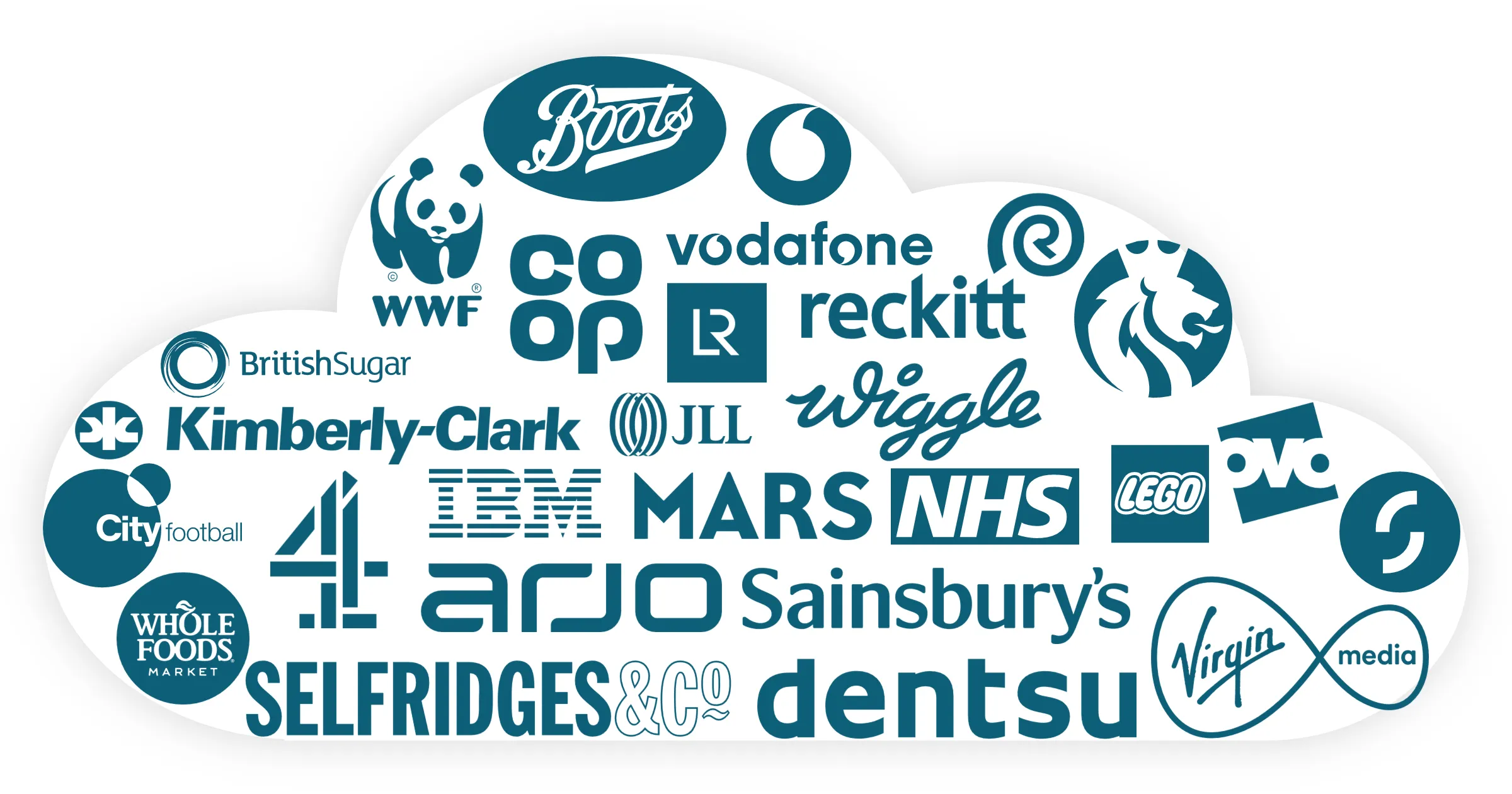
A logo cloud is a powerful visual. It says: look at all the great companies who want to work with us. Or: we have successfully implemented all these technology platforms. Or maybe: we can find you a recruit with experience at brands like these. Whatever you use a logo cloud for, you’ll have the same problem: how can I make it look less messy?
Logo clouds will always be tricky because it is in the nature of logos to be different. Distinctive. A collection of logos will vary wildly in colours, shapes and fonts. They range in size from square to wide. Sometimes they are simple, sometimes they are intricate. Sometimes text is big, sometimes tiny.
So how do you embrace the chaos? You take control of the colour. I’ve got two options for you.
Option 1: Arrange by colour

This is the quickest way of bringing some order to your logos: arrange them by colour using the rainbow: red on the left, then segueing through yellow to green then blue and purple. This sounds easy, but you’ll soon realise that many logos are not a single colour. And plenty of logos are black and white.
Let’s assume you want to put your logo cloud into a rectangle like the example above. Use this approach:
Start top left with logos that are mostly red.
Continue to fill to across following the rainbow, still placing just those logos which are chiefly a singly colour.
Now place your black and white logos along the bottom of your rectangle. If any of them have a splash of colour, put them roughly below logos of that colour.
Now deal with your logos with two colours. Make a judgement call on which colour comes through strongest (try squinting at it) and use that colour to place it.
Lastly, place any multi-colour logos. There is often no obvious spot to put them, so try grouping them together in the middle.
The more logos you have, the more flexibility you have. Even with a relatively small group, people will pick up on the rainbow colour order. Or you can try the second option…
Option 2: Monochrome logos
.webp)
This is my go-to for logo clouds: removing colour from the equation. It might at first appear to require more effort, but I believe it ends up as the easier option. Without colour to constrain you, logos can be placed wherever you want, so it’s easier to arrange them. And they don't distract from your brand's colour scheme.
The trickiness comes in removing the colour. And that depends on the file format you have your logos in:
SVG files are far and away the best format. Scalable Vector Graphics provide perfect quality at any size, are much small files and – crucially for us here – are easy to recolour in PowerPoint
PNG files are an acceptable second choice. Portable Network Graphics are like higher-quality JPEGS that – importantly – can have a transparent background. So you can get logos close to each other without overlapping.
WEBP files are another great second choice. This is a newish file format that (for our purposes) is like a PNG but even smaller file size. And PowerPoint will accept them. So if you come across a logo in .webp format, that’s fine.
Got a slide full of logos but not sure what format your logos are in? Simply select them. If a tab appears that says ‘Graphics Format’ then that is an SVG. ‘Picture Format’ means PNG, WEBP or JPEG (but you can’t tell which). If both tabs appear, then you have selected a mixture of SVGs and one or more of the others.
Struggling to find a good logo? Read our guide.
Removing colour from SVG files
The beauty of an SVG is that you can change its colour in PowerPoint. So simply select your logos and change the fill colour to whatever you have selected.
Sounds simple? Not always. Occasionally you’ll run into these issues:
The whole SVG turns into a solid block of colour
.webp)
This is usually because the logo designer has included a transparent rectangle around the logo to ensure there is some padding. You’ll need to remove it otherwise it will just take on the same fill colour and drown out the logo.. Undo the colour change, then select the logo, go to the Graphics Format tab and click Convert to Shape. Then you’ll be able to select the offending item and delete it. Then try recolouring.
Shapes or text that were different colours are now the same, and have merged together
.webp)
You’ll need to get a bit creative here. Perhaps you can convert to a shape as above, and delete some of the shapes. Or you might need to colour some parts of the logo the same as the background colour of your slide, so it looks like they are ‘holes’ cut out of the logo. If you are familair with the Merge Shapes functionality, you can even subtract parts of the shapes form each other to ‘punch out’ the logo detail as actual holes instead.
If that is too difficult, copy the SVG, and then paste it as an image file. This will turn it into a PNG and you can follow the instructions below.
The logo has gradient colours so it looks wrong when I change the fill
.webp)
The clever option is convert to shape, select the bit with a gradient fill and then change the gradient to go from black/white/your chosne colour to transparent. But that is time-consuming, so you could copy and paste it as a PNG as above.
Removing colour from PNGs (or WEBPs)
We have less options here. You cannot directly choose a colour like you can for SVGs. PowerPoint might make you think you can, with its Recolor function, but that doesn’t match your colour palette properly. Your best bets are black or white, or shades of grey.
If you are using greyscale logos, simply use Picture Format > Color and choose the top left option, which is Saturation: 0%.
For black and white, you will need to adjust a couple more options. With the logo PNG selected go to Picture Format > Corrections > Picture Correction options at the bottom of the dropdown gallery. This will open the Format Picture pane on the right-hand side. Adjust the following settings:
- Brightness: slide down to 0% for black, or 100% for white.
- If you don’t get quite what you need, try the contrast slider - but normally you don’t need to adjust it very far above or below zero.
- If you are still seeing some colour, in the Picture Color section, slide the saturation down to 0%
Now for the really fiddly bit: arranging the cloud
How I wish there were a function in PowerPoint that would automatically resize and rearrange logos until they formed a well-balanced cloud. No such luck; but here’s hoping Copilot will get on that soon.
The current reality is that this is a manual task which can range from relaxingly mindful to enragingly frustrating. I wish you luck. My tips are:
Place them roughly at first. If any logos seem to leap out, then they are possibly too big. Adjust the sizes until there don’t appear to be any logos that are too dominant.
Make sure there is sufficient space in between so that each logo can be seen as a separate item.
Avoid placing similarly shaped logos next to each other. Our brains will tend to see them as a pair or a group rather than as individual logos. The exception is when the logos are related, such as sub-brands of one company - keep those together.
Assemble logos into rows. Make the logos in each row roughly the same height, then distribute them horizontally. You may need to do this by eye where logos have transparent padding around them. Group the rows and then distribute them vertically, adjusting where possible.
Align the logos with the edges of the space they occupy. So top-align the logos in the first row, left-align the logos down the left, and so on.
Iterate a few times but bear in mind there is no one correct solution. Done is better than perfect.
A note on JPEGS
Avoid using JPEG files. The compression can make logos look pixelated and poor-quality, and you are stuck with the (usually white) background. It is rare to be unable to find a logo in any other format, but if you have no choice then you can simply desaturate it to create a greyscale logo, or you can also increase the contrast to very high to get a black logo.
For this reason, don’t use a screen capture to grab logos. Read our article about finding good logo files.
Want more tips like this in your inbox?
It's useful*
It doesn't flood your inbox (monthly-ish).


